The maps below show the changing geography of infant morality from 1880 through to 1910. The maps include the London and West Ham, which remained independent throughout this time period. Infant mortality rates increased across London during the final decade of the nineteenth century and were particularly deadly during the final years of the century. As the last map in the series (1906-10) and the chart below both clearly show, infant mortality rates improved significantly during the first decades of the twentieth century. I’m working on the final revisions of a chapter that explores the relationship between environmental conditions in West Ham and the unhealthy 1890s along with the vast improvements in the decades that followed and figured it would be interesting to share these colour maps and the interactive chart online.
This slideshow requires JavaScript.
Most of the data comes from the Vision of Britain website, which also provided the boundary layers. The data for West Ham comes from the Annual Reports of the Medical Officer of Health.
[1] Charles Sanders, “Annual Report of the Medical Officer of Health 1923” (West Ham: Public Health Committee, 1923), 40; Graham Mooney, “Did London Pass the ‘Sanitary Test’? Seasonal Infant Mortality in London, 1870-1914,” Journal of Historical Geography 20, no. 2 (April 1994): 161, doi:10.1006/jhge.1994.1013.
“This work is based on data provided through www.VisionofBritain.org.uk and uses historical material which is copyright of the Great Britain Historical GIS Project and the University of Portsmouth”
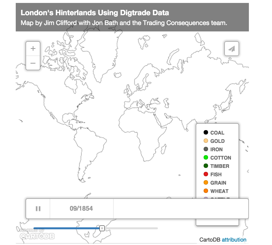
The map below visualizes the text-mined data produced by the Trading Consequences project. We queried the database to identify all the commodities with a strong relationship to London and then found every other location where the text mining pipeline identified a relationship those commodities at least 10 times in a given year. This results in 111,977 rows of data, each representing between 2841 and 10 commodity-place relationships. I will present this data visualization to the Social Science History Association meeting in Toronto this November.
The map above uses CartoDB’s Torque Cat animation to visualize the data as it changes over time. It only distinguishes 10 different commodities, which is already too many to really follow, and displays the remaining commodities in the Other category. The word cloud below shows all of the commodities and ranks them by the number of places and number of years they met the 10 relationships threshold (i.e. the words are bigger if a commodity had a lot of mined relationships with different places and these relationships remained consistent across the whole century).
It is also possible to look at all of the data from the whole of the nineteenth century to see the the locations with a high intensity of relationships with numerous commodities that also have a strong relationship with London.
[This map looks better when you zoom in.]
I should note that this data does not confirm a direct relationship with London and not all of these locations are a part of the city’s increasingly global hinterlands. Some locations would be competing markets sourcing the same materials or producing the same goods as London. British ports were also waystations where goods from the world were transhipped and sent on to other European centres. The text mining identified when a commodity term, like sugar, was in the same sentence as a place name. The text mining shows a strong correlation between London and sugar and a strong correlation between Cuba and sugar. In this case Cuba, I know from other sources, it was among the numerous suppliers of sugar to London. We cannot simply assume, however, that the strong correlation between Leather and Calais in 1822 meant the French port supplied London with Leather in that year. They could be a market for London’s leather or a competitor. To focus the map on London’s hinterlands exclusively, I would need to filter out results based on additional research and an extensive ground-truthing exercise. It would probably be more accurate to say these maps helps illuminate the geography of commodities related to London in the nineteenth century, but this data and the visualizations remain a starting point for further research (like the research I’m doing with Andrew Watson on leather).
You can download the data as a CSV file with this link.
Here is the abstract for the SSHA paper I’m co-authoring with Bea Alex and Uta Hinrichs:
Visualizing Text Mined Geospatial Results: Exploring the Trading Consequences Database.
I am working on an abstract for the ESEH in France next summer. I plan to focus on the role of an industrialist, J.E. Howard, in supporting the efforts of British government officials and economic botanists to establish cinchona plantations in Asia. I’ve done a lot of archival research on this topic, but I thought it would be interesting to see what I could find in the Trading Consequences database. The Location Cloud Visualization clearly shows the geographic transfer of cinchona to India and Ceylon, but I needed to dig down past our web visualizations to see what the database has to say about a particular person. To do this, I extracted every sentence that mentions the commodity cinchona in the Trading Consequences corpus, ordered them by their year and exported a text file from the database. This yields a file with 3762 sentences that mention cinchona.
Uploading this data into Voyant Tools makes it easy to explore some of the patterns in the text as it changes over the course of the nineteenth century. For example, we can see the initial importance of India (which would include mentions of the East India Company) and the growing significance of Ceylon and Java as the century went on. It is also notable that Peru and Peruvian were relatively less significant locations in these British government documents.
Using the same tool, we can see the rise and decline in popularity of an alternative spelling of cinchona, “chinchona”, during the middle of the 19th century.
Howard & Son’s factory at City Mills in West Ham
More to the point, we can search for the last names of five of the key individuals involved in the transfer of cinchona: Clement Markham, Richard Spruce, the father and son, William and Joseph Hooker, and John Eliot Howard. Markham was a Indian Office geographer who led an exhibition to Peru to steal cinchona seeds. Spruce, a botanist, collected further seeds from New Granada. The Hookers were both directors of Kew Gardens, with Joseph taking over from his father in 1865. Howard was one of the sons in the Howard & Sons company, which produced much of the quinine manufactured in Britain. In addition to his expertise as a manufacturer, Howard was a leading expert on the botany of cinchona. The visualization below shows that while Markham, Spruce and William Hooker were key figures in the initial planning and transfers of the early 1860s, Howard gains significance in the corpus in the decades that follow.
The real power of Voyant is that once you identify an interesting trend in the data, it is possible to click on the spike for Howard in the chart above and update some of the other visualizations. Below you can see “Howard” as a key work in context during the spike and further down you can see the actual sentences where Howard is mentioned. With a little more work I could have included the URL for the original document page.
By Jim Clifford First Published on ActiveHistory.ca
The map below drew a lot of attention on Twitter when I posted a few weeks ago in advance of a presentation I gave at an environmental history conference in early July. It was retweeted, not just by friends and fellow environmental historians, but also by Shawn Donnan, a World Trade Editor at the Financial Times. I think it gained traction because it helps visualize something historians and students who take our classes know, but might not be general knowledge: globalization did not begin in the late 20th century with the rise of industrial economies in Asia.
Extensive trade networks predate Columbus and the flow of silver from mines in the Americas through Europe and to China linked and transformed the world economy during the Early Modern period. The scale of global trade and communications has changed significantly over the centuries, but globalization has very deep roots.
By Andrew Watson with Jim Clifford First Published on the NiCHE website
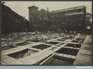
For the past two weeks I’ve been in Saskatoon, working with Jim Clifford in the University of Saskatchewan’s Historical Geographic Information Systems (HGIS) Lab. Since January 2014 I’ve been working with Jim and Colin Coates on the Trading Consequences research project thinking about how historians can use these valuable new text mining, database and visualization tools to understand the economic and environmental histories of global commodity flows during the nineteenth century. This trip to Saskatchewan has allowed Jim and I to focus our energies on using Trading Consequences for historical research. We used text-mined spatial data in conjunction with trade statistics and textual sources as a means of testing the search results and functionality of Trading Consequences. To do this, we chose a case study: the history of leather tanning related commodities during the nineteenth century.
Neckinger Leather Mills Wellcome Images on Flickr Creative Commons by-nc-nd 2.0 UK
We chose leather tanning for our case study because this topic intersects with both our research interests. Jim is interested in how industrial development across London, including the leather district of Bermondsey, contributed to broader environmental transformations through the development of global commodity flows. Part of my recently completed doctoral research examined the economic and environmental dimensions of hemlock bark harvesting for leather tanneries in Muskoka, Ontario during the same time period. Trading Consequences provides the opportunity to learn more about the ways tanneries in Muskoka and London functioned as part of transnational networks in hides, tannins and leather.
Apart from some primary and secondary source background reading, our work over these initial two weeks of research on this project focused almost exclusively on exploring nineteenth century trade statistics for Britain and, to a lesser extent, the United States. Theses statistics came mainly from the Annual Statement of the Trade of the United Kingdom with Foreign Countries and British Possessions, which the HGIS Lab’s research assistant, Stephen Langlois, entered into a Commodity Flows database. With the help of Jon Bath, Director of the Digital Research Centre at U Sask, Jim and I exported the statistics from the Commodity Flows database to create spreadsheets, graphs and maps, which we used to help us understand broad patterns and trends in the global trade of leather tanning commodities during the nineteenth century.
One of the tools we used to start to get a sense of the transnational connections of these commodities is SourceMap.com, a web-based supply chain mapping service, that allows users to generate maps populated with directional flow information. Using the information from the Commodity Flows database related to where commodities originated as well as their destination, Jim created four maps representing the flow of leather tanning related commodities at different points in the nineteenth century.
This first map shows the flow of leather tanning related commodities into Britain in 1800. Britain imported oak bark from Norway and Germany, shumac from Italy, and hides from all over Europe. This map also shows that oak bark and hides came from North and South America, but since the original source listed everything from across the Atlantic Ocean as originating in “The Americas” these flows are simply an attempt to indicate that both continents were likely involved at this time. What this map should demonstrate is that around 1800 leather tanning in Britain relied on local sources supplemented by Europe and the Atlantic world.
The second map shows commodity flows into Britain during the 1840s. Bark and other tannins continued to enter Britain from Norway and Italy, but it also came in from Australia, North Africa and North America (but not South America). Hides came in from all over Europe, but also South America, South Africa and India. By the 1840s, then, Britain’s leather tanning industries had clearly begun to develop global commodity networks.
The third map includes information for imports and exports of commodities into both Britain and the United States in 1865. The addition of flows into and out of the United States and the addition of re-exports data for Britain adds an extra layer of complexity to the story. Hides still flowed out of places like India, Africa and South America, but this map shows they’re ending up in the United States as well as Britain. A number of different types of tannins also flowed into Britain from places, such as Japan, Australia, the Philippines, India, Turkey, Syria and Egypt. What is clear from this map is that the United States is an important centre of leather manufacture and that the source of leather tanning related commodities had begun to diversify significantly.
The fourth map represents imports and exports for both the United States and Britain in 1895. With few exceptions, the nature of the commodity flows is much the same as it was thirty years earlier. The difference, however, is the diversity in the number of different places that sent both hides and tannins. Materials came in from literally every corner of the globe. Also of particular note is that the United States appears to have developed a distinct sphere of influence over commodity flows from South America. As this map illustrates, the leather industry in Britain and the United States became extensively global.
What the last two source maps do not convey, however, is the degree to which the British and American leather industries became intensively global in scope between 1865 and 1895. The four source maps, taken together, show the spatial component of changes to the global trade of leather tanning commodities, but they do not include information about the scale of these changes.
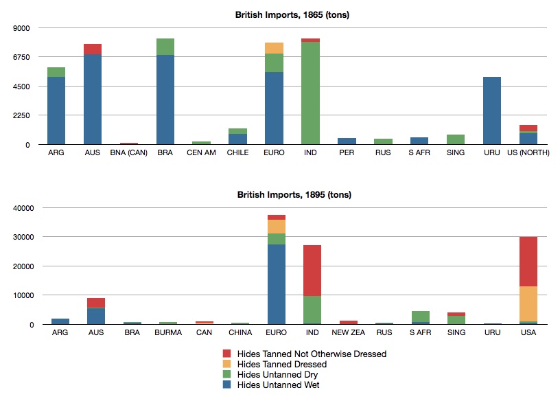
To get a sense for how the scale of leather tanning commodity flows changed, we exported the data from the Commodity Flows database into spreadsheets and created two simple bar graphs showing the amount by weight of four different classes of hides imported to Britain from the most significant locations around the world.
Immediately apparent is the fact that the total trade increased dramatically, while the number of significant supply locations dropped from six to three. Australia declined in importance, but by less than 1,200 tons in real numbers. The major decline occurs in the number of hides that arrived in Britain from South America. Uruguay sent over 5,200 tons of wet untanned hides in 1865, but less than 400 tons thirty years later. Brazil exported over 8,100 tons to Britain in 1865, and less than 750 tons in 1895. Argentina sent almost 6,000 tons in 1865, but only slightly less than 1,900 tons in 1895. The decline of imports of South American hides to Britain can be partially explained with the 1865 and 1895 source maps above. It is quite evident that South America and its commodity flows came firmly into the United States’ sphere of influence by the end of the nineteenth century and American import statistics confirm this trend.
Indeed, as the 1895 graph illustrates, the United States had become the most important source of foreign tanned leather for Britain. What appears to have happened between the 1860s and 1890s is that the United States leather industry assumed control over untanned hides from South America and, in turn, became a major exporter of tanned hides, particularly to Britain. What also stands out from this graph that is not immediately apparent from the source maps is the major shift in the type of hides coming into Britain from India. In 1865, almost all the hides imported from India were dry untanned. Thirty years later the total quantity of dry untanned hides imported from India had increased by less than 1,500 tons, while the amount of undressed tanned hides rose by more than 17,000 tons. Rather than export untanned hides, India’s domestic leather industry had begun to process hides prior to export to Britain.
With these visualizations, Jim and I were confident that we had a good handle on what the big changes were in the history of the global leather tanning commodity trade during the nineteenth century. The next step will be to use Trading Consequences to help us identify how people were talking about the leather trade and its commodities, how people were thinking about the kinds of trends and changes we were seeing (thanks to these visualizations) in the trade statistics.
And this is how Trading Consequences can be really useful for historians interested in global trade during the nineteenth century. Below is an animated map video of all the mentions of leather tanning related commodities contained in over eight million pages of primary source documents related to the history of the British world during the nineteenth century. By representing spatially the number of times hides and different types of tannins are mentioned in relation to specific places around the world, Jim and I will be able to narrow our focus to the more specific social, economic and environmental components of this history. By following these commodity-location mentions into the primary sources, we can identify important documents to help contextualize what we’ve seen in the numbers.
I would like to thank Jim Clifford for hosting me in Saskatoon for the last two weeks, Geoff Cunfer who provided me the space to work on this project with Jim in the HGIS Lab at the university, the Department of History for hosting my talk on July 30, the university’s Interdisciplinary Centre for Culture and Creativity Linking Fellowship for providing the funding for this trip, and Jane Westhouse for taking care of all the arrangements. It’s been a wonderful experience. The research has been funded by a SSHRC Digging Into Data grant and a SSHRC Insight Development Grant.
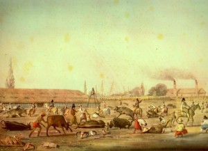
Impression of a Buenos Aires slaughterhouse by Charles Pellegrini, 1829.
 I am working on an abstract for the